How to Create Shadows with Markers: Color Theory Tips
I think most young artists know about the importance of shadows but do they know how to apply them correctly to their work?
What Are Highlights and Shadows in Art?
Highlights are areas where light hits an object directly; shadows are areas where light is blocked, and they work together to show three-dimensional form. First, let’s talk about light and what it is. Light allows us to see the forms of objects through highlights and shadows. Highlights are the areas where light shines on an object and are typically created by using tints of the local colors. You probably just had your first questions. What’s a tint and what’s a local color?
What Are Tints, Local Color, and Shades?
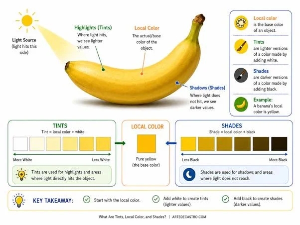
Local color is the base color of an object, tints are lighter versions (add white), and shades are darker versions (add black).
Tint is when you take a color and add white to it. Local color refers to the actual color of an object. For example a banana’s local color is yellow. So highlights on a banana would be tints of yellow.
Shadows are the opposite of highlights. Shadows are areas where light does not directly shine on an object. Most people use shades of the local colors to create shadows. To make shades simply add black to the local color.
Why Are Shadows Blue, Not Black?

Fushimi Inari Taisha in Kyoto, Japan
Here’s the secret, a lot of young artist get hung up on the fact that shadows aren’t black. Shadows are actually inherently blue. So when you create shadows in your objects it should have some degree of blue.
Take a few minutes and study the shadows of this Japanese gate. Notice how the shadows are not just black. The farthest parts of the shadow have hints of blue violet which contrast with the yellow orange sunlight reflecting from the tiles on the street.
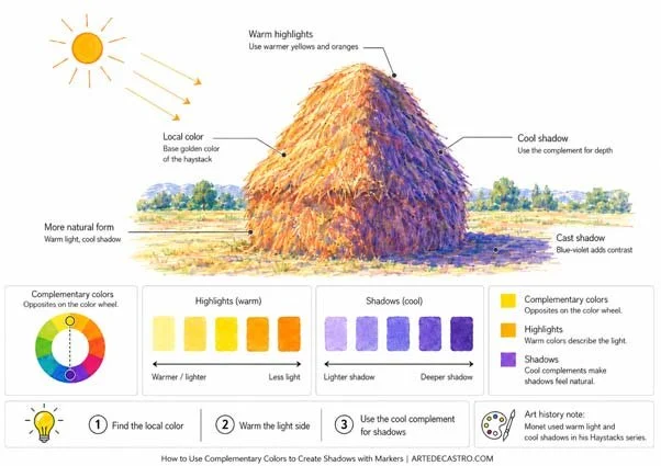
How to Use Complementary Colors to Create Shadows with Markers
If you really want to kick things up a notch dust off your old color wheel and put what you know about color theory to some use. Complimentary colors are opposites on the color wheel much like highlights and shadows are opposite. This means we can use the cool colors on the color wheel for shadows and warm colors for highlights. Using this method should help boost the contrast of your colors creating dynamic and more natural seeming shadows. These are the concepts that masters like Monet understood very well as you can see from his famous Haystack studies.
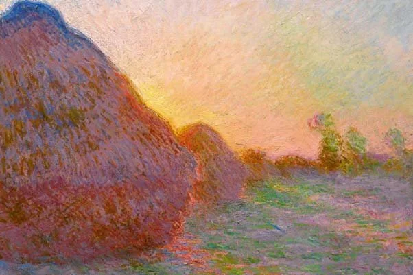
“For me, a landscape does not exist in its own right, since its appearance changes at every moment; but the surrounding atmosphere brings it to life.”
In the case of my Bruce Lee portrait you will notice where I have applied these methods to create the cast shadows under the chin, face and hands. His skin is comprised of varying hues of beige as the local color with highlights in tints of beige therefor the complimentary color should be some hue of blue violent which was exactly what I used to create the cast shadows on the skin.
“A wise man can learn more from a foolish question than a fool can learn from a wise answer”

I hope this Helped.
Like, comment and share with anyone who may need a refresher in using color to create highlight and shadows. I look forward to hearing your thoughts and questions. Don't forget to leave your instagram screen name along with your comment in case you want me to check out your work.
Your neighborhood marker slinger,
Ivan Castro